Heuristics
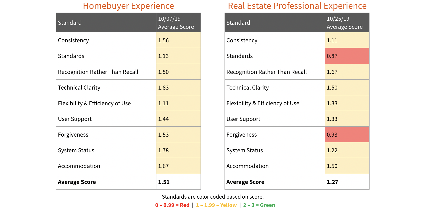
The team started by identifying usability gaps through a Heuristic Evaluation for each persona: the Homebuyer and the Real Estate Agent. We assessed the HomePath platform across all platforms including website, mobile responsive site and native mobile app to quantify the overall user experience for the product through the lens of the homebuyer and real estate professional.
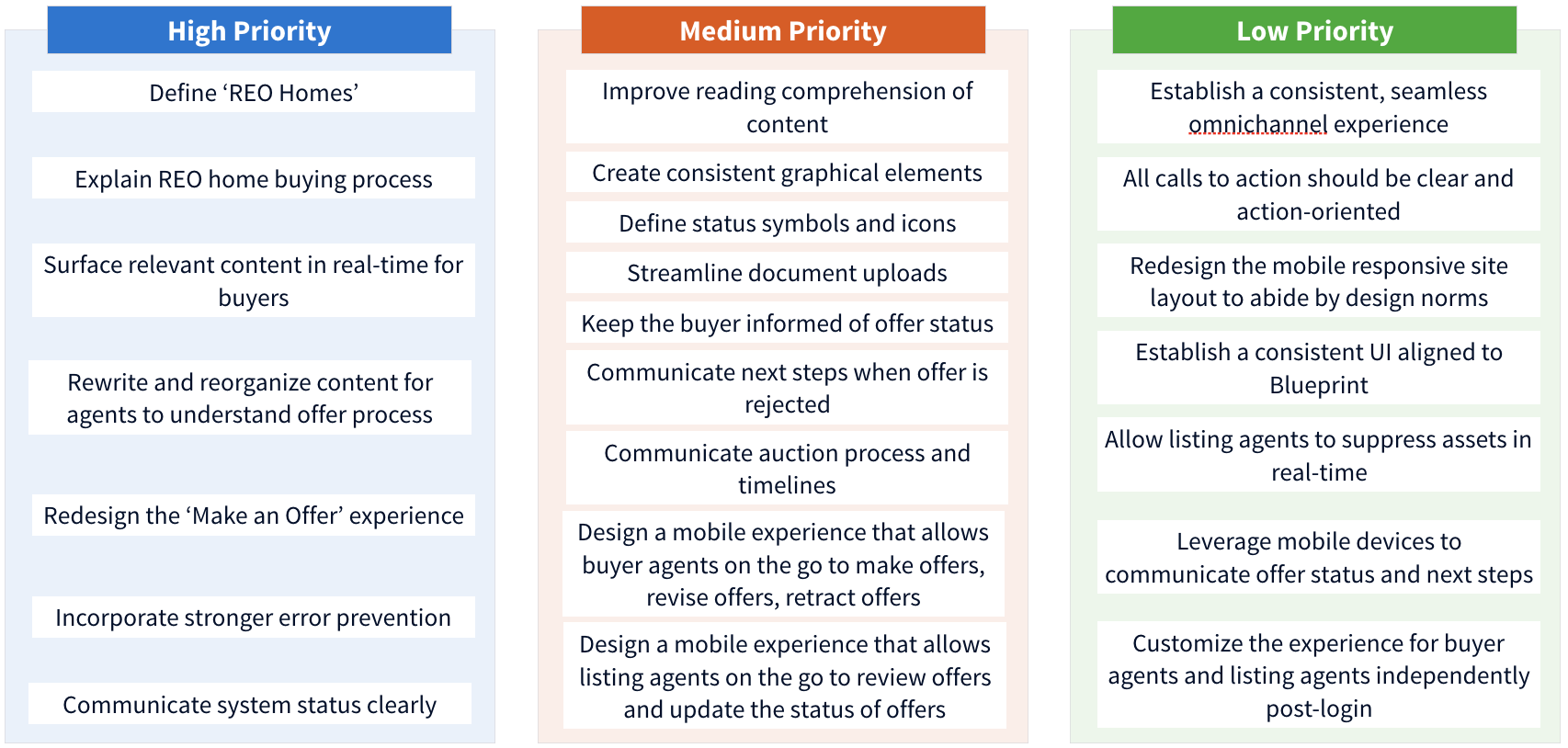
The heuristic scores guided the focus of our design recommendations and helped us to prioritize between high, medium and low.


Recommendations
Define REO homes and explain the buying process
- Help users connect the dots between industry terms and Fannie Mae branding.
- Define "Fannie Mae owned properties" and make a connection with the industry term “REO home” in a clear and transparent way.
- Add easily findable content to explain the differences and similarities in the process of buying REO homes vs. the traditional home buying process.
The Ready Buyer Page was the #1 most visited page, accounting for 13% of total traffic
Keep the buyer informed in real-time
- Better inform buyers of their offer status in the event the agent is not communicating effectively with them.
- Better explain terminology such as "online offer" or "new" with graphical icons. Make status definitions clear through the design to help users understand what the status signifies by creating consistent and intuitive graphical elements.
Improve reading comprehension
- Rewrite the content throughout the site to resonate with a broader audience. This will help lower the risk of alienating users.
- Reorganize the site's information to surface in strategic places, which will help to increase users' comprehension and retention.
Homepath content scored somewhat difficult to read, with readers needing to be between the ages of 18-19 years old (college level entry)
High Impact Changes
Next, we applied the findings of the heuristic evaluations through mockups and wireframes, redesigning a more optimal user experience to address some of the shortcomings.
An Improved View of Search Results
- Better maps
- Better listing details page design
Real Estate Professional’s Journey
- Stronger error prevention
- Optimized and re-designed “Make an Offer” workflow
All Journeys
- Improved home page
- Consolidated FAQs
- Mega footer